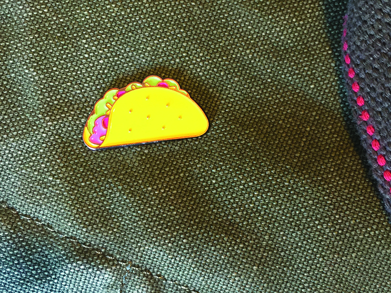
No lapel is complete without a taco pin. These 30mm, 5-color taco pins are ready for your pin-accepting garmets. Grab one (or 12) today. Tell your friends! Grab a pin below, or you can get one on Etsy.
Tag: design
-
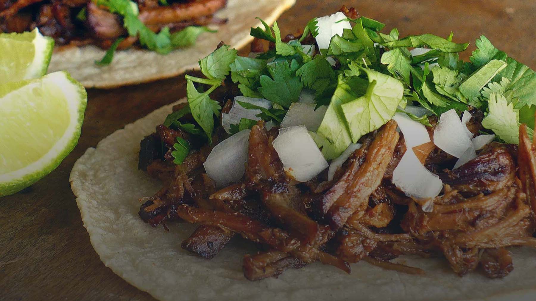
Taco Ipsum — now every day can be taco tuesday … in your placeholder text.
Because it’s important to have another placeholder text generator in your life, and tacos are tasty. Next time you mock up a page or build a prototype, why not fill it with Taco Ipsum, the most delicious placeholder text available on the entire internet. Remember, sharing is caring ❤.
-
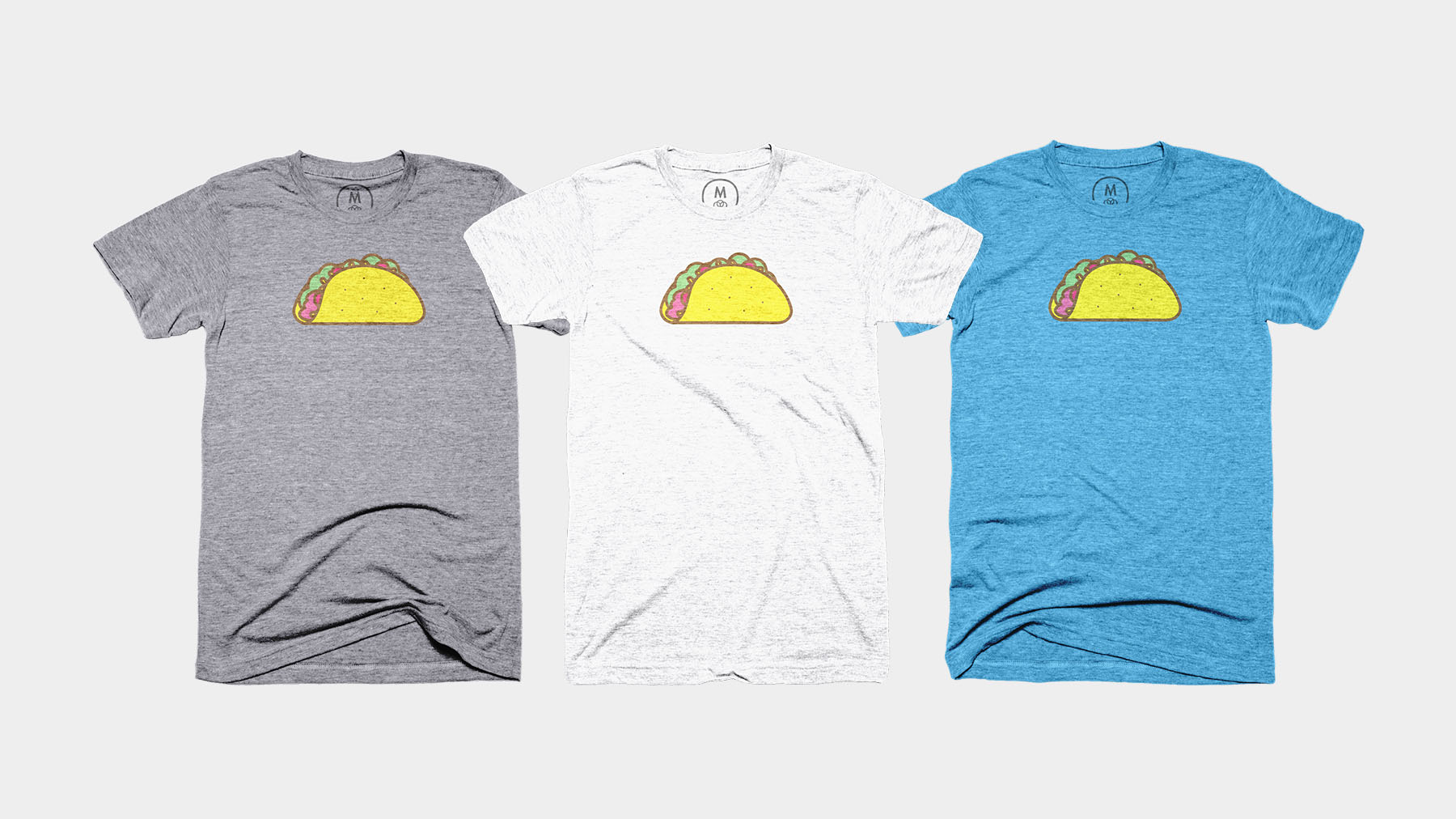
Taco tee at Cotton Bureau
Thrilled to announce my taco tee was accepted to be featured on Cotton Bureau. Cotton Bureau is a very tightly curated custom t-shirt community, and they are a cool little company that prints really great shirts. They have a 12-sale minimum for designs to go to print, and as of this writing (day one), we’re at 5, almost half way there! Help this t-shirt go to print and order one today. Thanks!
-
Buttons are cool, but taco buttons are awesome
I figured why not make some buttons. You can buy one for yourself, only $3.50. They are 1.5″ round. Just click the button below, enter your deets and I will send one over. Thanks!
-
A taco sticker for you, and one for you
I made this illustration and decided it would make for a neat sticker. Now you can get some for yourself and all your friends.
Head on over to Sticker Mule and grab one. You can order as few as one. If you do, be sure to send over a photo of where you stuck it so I can add your photos here. Thanks!
Update
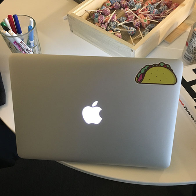
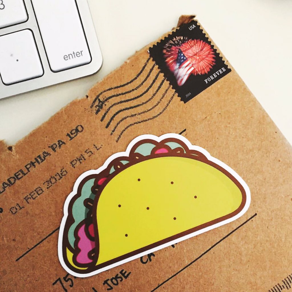
Some taco stickers in the wild.
-
Auto-play and muted YouTube Video Background
I needed a reliable way to use video as a background element, and HTML5 video requires too much up front work. For instance, you have to edit a base mp4, and convert it to atleast 2 other types (WebM and OGG) for proper browser support. Obviously, uploading a video to YouTube makes that so much easier, as they deal with the browser support part of things for us. Using this script makes things so much easier, just replace the Playlist and videoId variables, and you’re set, the YouTube API does the rest.
-
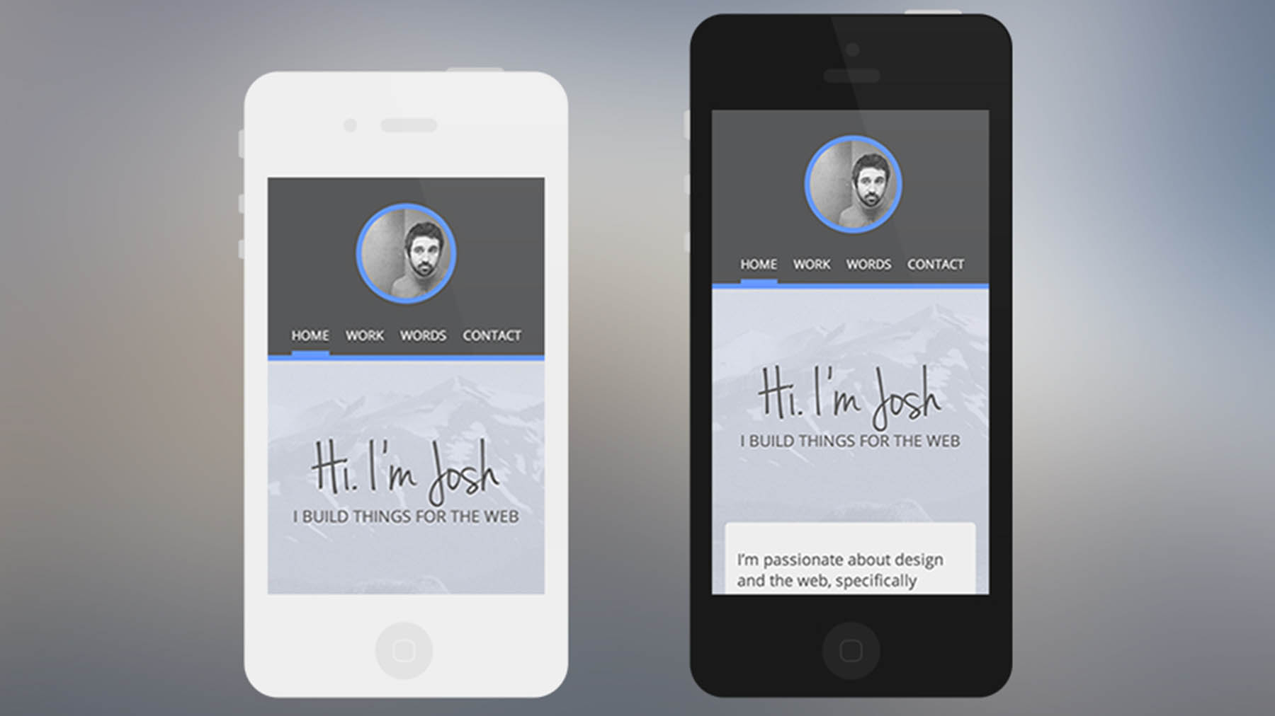
Free scalable vector iPhone 4/4s, iPhone 5 PSD mockup
I put together a scalable iPhone 4/4s and iPhone 5 vector PSD, and figured I'd share it. Grab a copy below, and if you like it, please share
-

Some thoughts on front end design
The other day I did something I don’t often do, and that’s to browse the popular page on dribbble. I could tell a distinct difference between those designers with front-end knowledge, and those without. It got me thinking about my own experience over the last few years, and I took a look back at some of my previous work. I came to the conclusion that as my knowledge of front-end development and it’s capabilities increased, my design skill in photoshop also increased. These two things, front-end development, and the ability to build pixel perfect mock-ups in photoshop, are wonderful skills to have individually, but when combined they become exponentially more powerful.
With the ongoing developments of CSS, bringing the layer-styles of photoshop to the browser is much less painful, but that’s beside the point. Having the knowledge of browser capability, with regards to both style and layout, make any designer a more valuable asset. For example, last year before I started working for the VOX product team, I was approached by a client with an in-house graphic designer (graphic does not mean web, this is important to learn). She had mocks ready to go, I use the word mocks lightly. The scope of the project was rather straight forward, the designer would supply the mocks, and I was to build out the site. Unfortunately, it was a take-it-or-leave it opportunity, since the mocks were not complete, and there was a fast approaching deadline. I reluctantly took the job. Days later I was provided with the mocks. Upon opening them in photoshop, what immediately stuck me was a lack of guides. I figured they were off by default, a quick CMD + H should do the trick. Nada. Welp, no guides, not a good sign. I setup some quick guides to check layout across the different pages. Nothing lined up, no common elements, no grid system. Not to mention, buttons that looked as if they had come from MS Paint, flattened and rasterized layers everywhere, no layer styles used (I think some of the elements were screenshots o.0). A quick email to the client to explain my findings lead to a ‘it’s a rush, just get it done’ answer. Upon finishing the project for review, the client was quite confused as to why the site wasn’t exactly like the mocks. My explanation that a) we had already discussed this and, b) because it followed no grid system what so ever, common elements failed to exist, and your ‘web’ designer must have assumed I was going to use the mocks as a flat image and use image mapping for links. /rant. This example is an extreme scenario, and sometimes when working for yourself you take risky projects, but I learned alot that day.
I have come to some conclusions about designing for the web. Photoshop was built for image editing, not web design. And while it has become the tool of choice (my tool of choice) for many when mocking up websites, it fails to provide any guide (or warnings) into what happens once the mock is done. Having the knowledge, even basic, of the capabilities of the web browser in terms of markup and style gives any designer a huge advantage when designing for the web. One thing static mocks do well is provide a relatively quick visual example of what a site will look like. They are also great when designing for a native device or application. Conversely, a static mock gives no insight into interaction, it’s frozen. What happens when I do this? Well wait, let me update my mock.
Designing for the web is changing (or may have already changed). For me, I’m using photoshop less and less. With almost every device being a smart one, and with the number of different sized viewports growing by the minute, Photoshop is becoming less valuable to design for the web. Photoshop is a great tool for laying out design to represent a number of viewports, determining color schemes, grey-boxing, and it’s likely most valuable for editing photos. I’ve taken design past Photoshop, and into the browser, where you can see, physically, how text responds across devices, how padding and margin are being used and how they affect other elements, and how multiple elements interact with one another. It’s impossible to design to the requirements of a user solely in Photoshop. This made me realize, a beautiful website that provides a bad experience is much less valuable than a basic website that provides a great experience.
The popular page on dribbble displays some beautiful, and often trendy work. Work that appears to be completely hashed out, pixel perfect websites. I’ve realized that although these mocks may look great, that doesn’t mean they work, or in actuality, will ever see the light of day. My point is, unless you plan on framing a website mockup to hang on your wall, it’s rather useless until it gets marked up. Also, I urge those pixel perfectionists to learn even basic HTML and CSS, familiarize yourself with grid systems, and study website behavior across different breakpoints. It will, in time, make you a more valuable, and in my experience, a better web designer.